Smash burger truck
Build this concept around one patty, one griddle workflow, and toppings that cross over between burgers, fries, and specials.
A focused menu sells more than a long one, and this guide helps you build it.
Updated July 2026
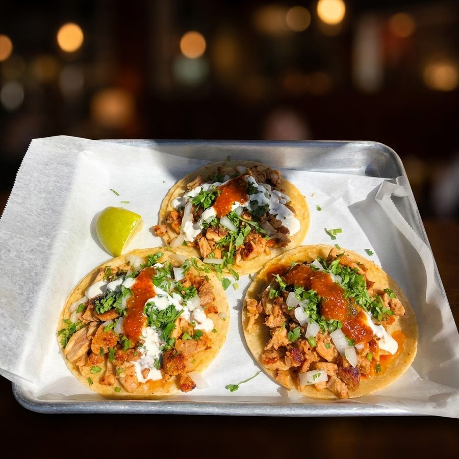
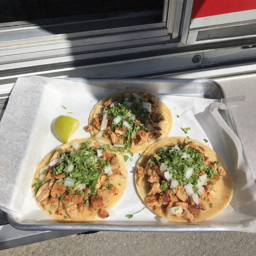
Treat these as starting structures, not a list to copy whole. A useful idea fits the truck's equipment, sourcing, crew skill, event mix, and point of view. Test names with someone outside the business: a customer should understand the format and the defining flavor before reaching the window.
Build this concept around one patty, one griddle workflow, and toppings that cross over between burgers, fries, and specials.
Choose fillings that can be prepped in batches, held safely, and portioned quickly. Let salsa, pickles, and herbs provide contrast.
A bowl menu works when guests make a few clear choices rather than assembling from a long list. Limit bases, proteins, sauces, and finishes.
Dessert service rewards tight portion control and visual finishing, but melting, frying, and long customization queues need firm limits.
Speed comes from a short drink architecture, clear sizes, and a few house flavors. Food should be easy to hand over without blocking beverages.
A regional concept works when the board explains unfamiliar terms plainly and the kitchen commits to a specific point of view.
Pricing starts with the truck's own recipes and constraints. Write a repeatable portion for every component, record usable yield after trimming and cooking, and include the complete service package. A main item may also require a tray, wrap, cup, lid, napkin, condiment, and disposable utensil. If those pieces are omitted from the calculation, the menu will be built on an incomplete picture.
Next, examine the menu as a system. Core items should make sense beside one another in portion, preparation, and customer expectation. A signature item can sit at the upper end, while a simpler entry item gives a clear path into the concept.
Ingredient cost is only one input. Count trim loss, cooking yield, garnish, packaging, condiments, card fees, labor touches, holding space, and waste risk. An inexpensive ingredient can support a costly item when it needs a separate prep process or spoils before the next event.
Ask what remains from an item after its direct food and packaging costs, then consider how much line time it consumes. A dish with a favorable ingredient ratio can still be a poor menu choice if it slows several other orders or requires frequent remakes.
A larger signature build can establish the upper end of the menu and make simpler core items easier to compare. It should still be a real, worthwhile choice, not a deliberately weak decoy. Keep the differences in portion and ingredients clear on the board.
Round prices can feel direct and are quick to read on a busy board. Charm pricing uses endings just below the next whole number and can signal a more retail-like offer. Either approach can work. Consistency and clean tax communication matter more than switching styles item by item.
Review performance with context. An item that sells often may still overload the griddle, while a slower seller may use spare capacity. Look at sales, direct cost, waste, remakes, ticket friction, and prep time together.
Presentation affects what pricing can teach you. If a valuable item has an unclear name or is buried on the board, weak sales do not yet prove weak demand. Clarify the description or placement, then observe again. The same logic applies online, where the menu photo ROI framework helps owners separate image costs from broader menu and operational factors without promising a result.
The physical board has seconds to explain the food, main choices, included components, and ordering path. Put the concept and core items where a person in line can see them before reaching the window. Group related items, keep names short, and explain an unfamiliar dish in one plain sentence. Place dietary notes beside the relevant item.
Design for the actual viewing distance. Small type, compressed lines, glare, and low contrast force questions the board should answer. Keep temporary specials in a defined area. When something sells out, cover or remove it cleanly.
Online listings need the same structure, but customers cannot smell the griddle or watch a plate leave the window. Use explicit category names, accurate modifier groups, and descriptions that identify the format, main ingredients, sauce, and included sides. Check the mobile view after publishing because category order, truncation, and thumbnail crops can change what the customer sees first.
Photos matter most when they resolve uncertainty. Photograph a signature burger, a less familiar regional item, or a bowl whose toppings distinguish it. A broad food photography guide can help establish consistent light and framing, while the smartphone menu photography workflow is useful when the truck handles routine updates internally. For a DoorDash listing, prepare a separate export that follows the current DoorDash photo requirements.
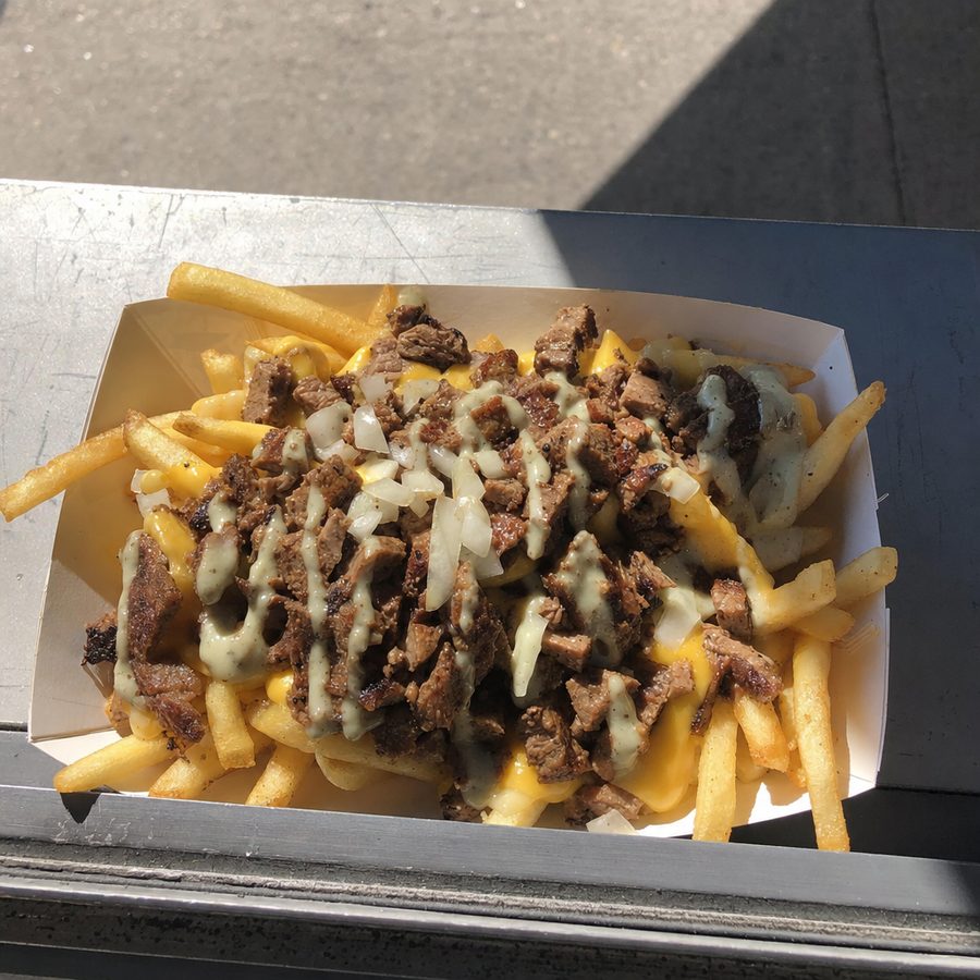
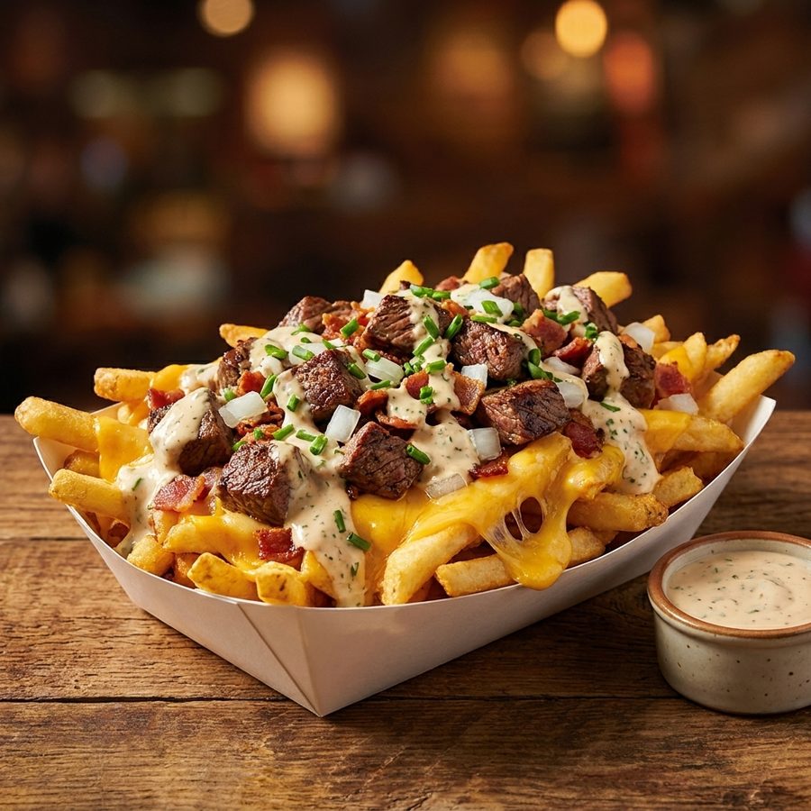
Every photograph should show the item customers receive. Keep the real portion, bun, packaging, toppings, and included side. Do not let cleanup invent ingredients or hide a messy product that will still arrive messy. Save the original phone file, make destination-specific crops from it, and replace the image when the build changes.
Harsh midday sun and an awning shadow are common at a truck window. The same tray of loaded fries reads far better once the light is evened out for the online listing.
Before
After
More choice is not automatically better. Do not add another item when the existing line misses ticket expectations, the crew still needs prompts for builds, cold storage is full, or prep is already spilling into unsustainable hours. Those are capacity signals. A new name on the board does not create the station, attention, or holding space needed to serve it.
Expansion is also risky when an idea depends on a unique ingredient, fragile sourcing, specialized equipment, or a long explanation. A special can test demand, but it should not quietly become permanent after early praise. Measure whether it sells after novelty, causes waste, or disrupts mixed tickets.
Sometimes the better move is subtraction. Remove a weak variation, clarify the core build, improve the side, or create one sauce that gives the truck a stronger identity. A smaller menu makes it easier to train a substitute crew member, forecast purchasing, keep photos current, and maintain the same result across a festival rush and a quiet weekday stop.
Do not remove an item solely because its photo or board position is poor. First determine whether the food, the operation, or the presentation is failing. Fixing the wrong layer wastes effort. Expand only after the core menu is clear, repeatable, and leaving genuine capacity for another useful choice.
There is no universal count. Start with the smallest menu that expresses the concept and keeps the crew moving during the busiest service. Count distinct prep jobs, cooking paths, modifiers, and storage needs rather than counting only the names printed on the board. Add an item only when the line can absorb it without lowering consistency.
Strong food truck items are easy to identify, practical to hold or finish in a compact kitchen, comfortable to carry, and resilient for the time between handoff and eating. Burgers, tacos, structured bowls, sandwiches, portioned desserts, coffee, and focused regional dishes can all work when the workflow is designed around them.
Usually, a few meaningful choices are safer than open-ended customization. Let customers choose among defined proteins, sauces, or dietary versions while keeping the core build fixed. Every modifier should be easy to communicate, stage, and verify at handoff. Remove choices that create confusion without changing the experience much.
Price from the actual recipe, yield, packaging, labor touches, waste risk, and operating context. Then compare each item with the rest of the menu so portions and value make sense together. Use a consistent rounding style, review costs when inputs change, and do not copy another truck whose recipes and operating costs are unknown.
Not every physical menu board needs a photo. Clear names, short descriptions, readable type, and a logical order can be enough at the window. Photos are more useful for a signature item, an unfamiliar dish, and online listings where customers cannot see the truck. Every image should match the portion and ingredients served.
Change the menu when there is operational evidence for doing so, such as unreliable sourcing, persistent waste, a slow item, a new service setting, or a seasonal ingredient that fits the concept. Avoid changing several variables at once. A stable core helps the crew build speed and gives returning customers something dependable.
Run it as a clearly limited special using ingredients that already overlap with the menu. Record prep time, sales, waste, ticket complications, customer questions, and whether the crew can execute it during a rush. Keep it only if the result strengthens the menu after the novelty wears off.
Consider removal when an item sells rarely, wastes a unique ingredient, causes mistakes, travels poorly, blocks a critical station, or no longer fits the concept. Before cutting it, check whether the name, placement, description, or photo is hiding a sound product. An operational problem and a presentation problem need different fixes.
Shoot, fix and publish menu photos: lighting, styling, dish by dish.
Shoot menu-ready dish photos with a phone you already own.
Current DoorDash menu photo specs, rejection reasons, and how to fix them.
Photo specs for every major delivery platform, compared side by side.
MenuCapture turns existing food photos into clean, consistent menu images while keeping the truck's real dishes recognizable.
View pricing